Inspiration
Before any project can begin, there has to be some sort of inspiration for it. Nothing ever comes from nowhere.
Like Pablo Picasso always said:
Good artists copy, great artists steal.
My inspiration came from a combination of a template redesign panel at work and the org chart I created for a recent eLearning Heroes Challenge. I wanted to create something that I could touch and feel. I needed to play around with what it might look like.
The animation for the menu needed to be fluid and animations needed to go both ways, nothing jarring.
With that, I had a good basis for creating something that had sections defined by colors and fluid animation.

Logistics
I wanted the template to be unique, and lack all hints of Storyline. While I love Storyline and all that it can do, it is just a tool. I don’t believe a tool should dictate the design, nor should anybody be able to tell what tool a design was created in.
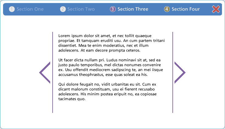
I also wanted to give the user the largest viewable space for content within the project. This means a great deal of white space, and full screen views for content that fit the full screen need.
This meant a menu that was not persistent, it vanished when not needed but was accessible within one click. It also meant text boxes limited in width therefor also limiting the amount of text possible on the screen.
Text box width limitations are important, it’s been proven that people read quicker and comprehend better when words across are limited. Another benefit these narrow text boxes allowed for was plenty of space for visuals that lent themselves to a project.
In section three of the project, I felt it would be a great opportunity to display how full screen content could fit into the template. It also gave me the opportunity to get creative and show how a story told with visuals and limited words could be more effective than just words.
Problems
Before I get into the details of how the template is set up, how I did it, and how to change it, it’s always wise to discuss the problems experienced and how they were overcome.
Menu On Top Layer
One problem I experienced was with the menu button and drop down. The problem didn’t arise until I began working on the full window contend and needed the menu button on top of everything.

Storyline has this odd little thing were master slide items are below the content of the slide by default. This meant that I couldn’t just put the menu button on the master slide and expect it to be on top at all times. It was below the full screen images which wouldn’t work at all, what if the user wanted to leave that section?
After a bit of searching, I found out that it was necessary to have the menu button in a layer, then called with a trigger. This trigger forced the menu layer to appear on top of everything, including my full screen images.
It took me a while to figure out how to do all this so it worked from all slides of the project. I ended up with the menu in it’s own layer and a trigger on the master slide showing that layer when the timeline started.
No Menu
The second problem was the intro slides into each section. The menu button didn’t need to show up on those slides.

To solve this problem, I had to create a second master slide with a blank sub master slide below that. This layer doesn’t contain any content at all, or any triggers, it’s just blank.
The four intro slides to each section use this special master slide, so if you want a slide without the menu button, you need to use this layout. I didn’t create any other layouts though. I assumed if you had content on a slide, the menu needs to be there.
Now that all these problems are resolved, down to the dirty stuff on how I did it, and why you should stick to the simplicity of the template (although you’re in no way required to).
Keeping it Simple
Menu
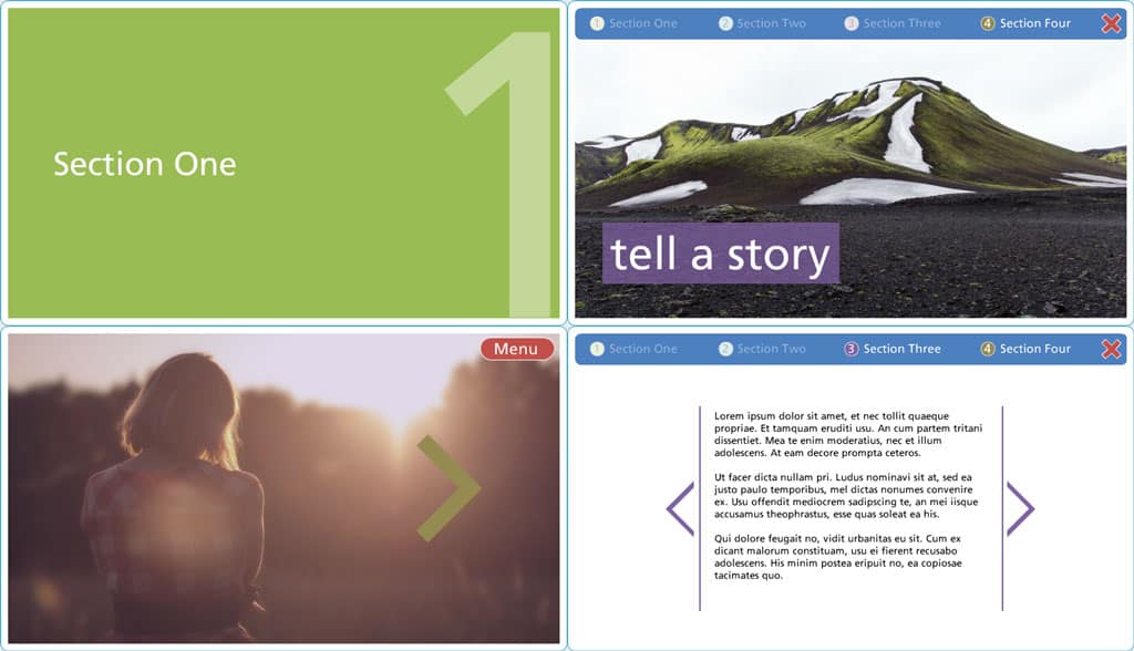
The most common piece you will want to edit first is the menu. It was designed to fit four sections, if you have more than this, you may want to re-design your content.
Each section is color coded within the colored number circle.
To edit the menu, you’ll need to head over to the slide masters. In the first slide master, you’ll find three layers, the menu button, menu, and menu out (this is to provide that seamless menu slide-out animation).
Open the menu layer and change the names as you please, after you’ve modified them be sure to also make the same modification in the menu-out layer. If you fail to make the same modification, the animation of the menu out once and item is clicked will be jarring and odd looking. Not even one single pixel can be off.
If you’d like to simplify the naming of menu items, you could set up four variable for each section and replace the text for each in the menu and menu-out layers to those variables. This way you’d just have to change the variable and the rest would be taken care of for you.
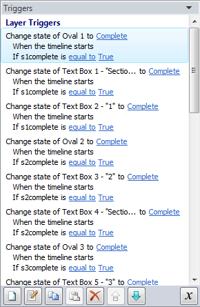
You’ll also notice that each menu item dims as they’re visited. I’ve created states for each menu item, that state is used if the complete variable for each section is true, meaning the user has completed that section.
Modification to when each section is complete should be done in each respective section.
That’s it for the menu! You’re ready to change the content!
Sections
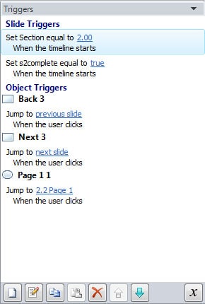
Each section has a trigger that sets the section variable equal to the number section you’re on. If you add a slide, be sure to copy that trigger over. This way the menu knows where the user is, and where to send that user once the menu-out animation has played out.
There are various elements you can use on each slide, it’s up to you if you use them.
One element is the next and previous arrows. They are traditional navigation methods and don’t lend themselves to bouncing around and exploring the course, this is where the navigation dots come in.
Navigation dots (don’t know the actual UX term for those) are a great way to allow the user to go wherever they want in a section. It also tells them exactly how many slides they have in the section and how long they have to the end.
It’s not necessary to use both the arrows AND the dots, but it can’t hurt.
Once a user reaches the end of a section, an arrow is necessary even if you chose not use them as your main navigation method. With the last arrow, make it the color of the next section. this signifies to the user that they’re done here and moving onto a new section. The color theme will then change to the new color.
At the end of each section, make sure to add (or copy) the trigger to set the section complete, this will ensure the menu item is dimmed so the user knows they’ve been there, done that.
Full Screen Content
This is the most important piece to this template, and one that should be used much more than the text slides and other navigation buttons.
The menu will still be there for easy navigation between sections, but the user will be engrossed in a full screen story or scenario.
I created a sample of this in section three on the second page. Once the user entered the story, navigation outside of section navigation fails to exist until the end.
I set it so the user is marked as completing this section from the start, as there’s nothing worse than being forced to go through every detail. Only the user can determine if that content is required by them.
Again the colors are pulled into the story, but they make a difference (sweat the small stuff). Towards the end, the color changes to the next section color, signifying the end, and movement into the next section. This is cemented by the arrow that exists at the end providing easy navigation onwards.
Completion
That does it for setting up the template. I didn’t go into creating a whole bunch of quiz sections or anything as I’m not a big fan of quizzing, but I’m sure those could be put in if necessary.
I had fun making this template, and am glad people have been receptive to its simplicity and possible excessive white space (if that’s possible!).
21 comments
Lizel
How can I download your template?
Nick Leffler
Hey Lizel, you can download it on the portfolio page where I demo the template, here: http://old-nick-leffler.local/project/colors-storyline-template/
There’s a blue button that says “Download .story”
Let me know if you find it OK!
Craig Hadden
Nice template – thanks for sharing it Nick!
Good idea about using variables to store the section names for the menu. I’m all for making maintenance easy!
I use Storyline and have written a couple of blog posts about it. I’d be very interested in your thoughts, and by all means leave a link back to your own site if you’d like to!
http://remotepossibilities.wordpress.com/2014/05/12/rotate-meter-needles-in-articulate-storyline-or-powerpoint-via-david-anderson-elearning-video/
Nick Leffler
Thanks for the comment Craig! I thought of the variables for the menu items after creating the template, but I probably should go back and update the .story file, just makes sense.
Kai
Awesome work nick! I really like your template. I am trying to change the color scheme, especially that of the menu button and the menu colors. For the life of me, I can’t seem to find it in the master slides. How do I see it?
Kai
Silly me…duh!!! Ignore 🙂
Nick Leffler
Does that mean you figured it out? 🙂
It is kind of buried in the master slides (first slide) and then each item of the menu (button, in state, out state) is on a separate layer.
Let me know if you have any questions!
Kai
Yes, I got it thanks! I have another question – How come the menu button disappears when I am navigating to the 3 layers I have added? Is there something I should check or uncheck? i.e. I have 3 buttons ( button set) that takes the user to the 3 layers.
Nick Leffler
The menu button is a layer itself and the default action for a new layer in Storyline is to hid other slide layers. You’ll have to go into the settings of your added layers and un-check the “Hid other slide layers” box in order to ensure it is persistent even through other layers being opened.
If you don’t want the user clicking on the menu button or anything but want it to stay, you have two options:
1. Select the “Prevent the user from clicking on the base layer” or
2. create a large shape under everything on your layer that covers the entire slide, the menu button won’t show through that but will remain accessible when the user closes the layer.
Kai
Ok. Let me try and see. I do want the user to access the menu button whenever they need to.
Nick Leffler
That’s good, open is good 🙂
You’ll have to change that setting on each of the layers if you have more than one.
Let me know if that works.
Kai
Ok, it worked. However, as you mentioned it is a layer and once I navigate away from the current layer and access the menu button, the current layer disappears and it leaves me with a blank space. Does that make sense? 🙂
Nick Leffler
It does make sense.
You’ll have to change the same setting inside the slide master for both the menu and menu-out layers. Currently its default is to hide all other layers when it opens but works as you’d like if you unselect “Hide other slide layers”.
Kai
Hmmm…I did that as well… LOL!….Now the menu button disappears when the menu out layer is active (when I click the ‘x’)
Nick Leffler
Well I’m going to have to say hmm also. I know the problem, I just don’t have a solution at the moment. I’ll play with it this evening and let you know what I come up with.
The problem is with the X in order to close the menu and leave the slide where it is.
Anyhow, I’ll let you know.
Kai
I am glad you understand my dilemma 😉 Thanks a lot!
Nick Leffler
I can’t figure it out, at least right now. When you switch off hiding other layers the X stops working completely after the second click no matter if you have another layer open or not. I’m leaning towards a bug but I’m just not sure.
I tried all sorts of things with triggers and variables but nothing seems to work even though I’m thinking it should, possibly a wrong thought though.
Best to maybe enroll the awesome Articulate community on troubleshooting this one and verifying though.
Kai
Yes, me neither. Wrecked my brain last night. I have layed out my whole course and am 75% done. As I was testing it with the layers yesterday, this issue came up as you know. I am thinking about a work around. What if I place the menu layers on the top and not on the master. Do you think that will work?
Nick Leffler
You could possibly do that, I think you’re saying copy the menu layers into a slide? The reason I put it in the master is because I wanted them to be persistent across the entire template unless specifically not needed.
It would add the additional pain of having to go back and change multiple locations to modify the menu though, but that’s up to you.
Only way to truly find out is to try it 🙂 Let me know if things work out though. I’m not seeing anybody even attempting to answer these questions from Articulate, gets a bit complicated.
Kai
Hi Nick, to your point- it is too clunky. I am so bumped at this. I was really hoping that someone could help us out on it. I will make a comment and see whether someone can reply.
Nick Leffler
After this much time with no answer on Articulate forums, not even an idea, I’m thinking it might just be a bug. The logic behind the menu dissapearing just doesn’t make logical sense in the flow of the project, just seems buggy.
Comments are closed.